Traditional Art Week
DISCLAIMER: The following article is a discussion on the characteristics of monochrome paintings. While discussing, I will go through a procedure of a monochrome painting. So you are free to take tips, tricks and ideas from the procedure if you like, but the article will not be considered as a tutorial or a teaching material.
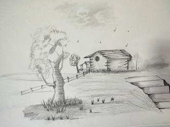
Monochrome paintings are considered to be the avant-grade paintings. It is indeed hard- to establish all the values with a single colour. But moreover, what makes it so special? What makes it top class ?
Because working with monochrome is playing and experimenting with the lights and values - that takes artistic courage. Almost all the artists have few monochrome paintings in their life. These are like the stages or better said evidences of their artistic maturation - far away from the overwhelming colours, seeing the truest form!
In my personal opinion, black and white paintings are not monochrome. There is no 'chrome'! Instead, they are pure light and dark - the unaltered underlying raw truth - no scope of distracting colours, accompanied with purest unstable or calm mood, often dramatic - this is the truest form of visualization - untouched by the luxury of any hues. The raw mood and emotion only lays there - light and dark - black and white!
Up next, we will go through a procedure of the making of a monochrome painting, using only black and white acrylic and black ink. The surface is a preprimed textured off-white paper especially made for oil paintings. But it's good for acrylics too. The aim of this walkthrough will be how we establish values layer after layer to complete an entire scene, with a little escape plan. And meanwhile I will discuss the characteristics of the monochrome paintings.
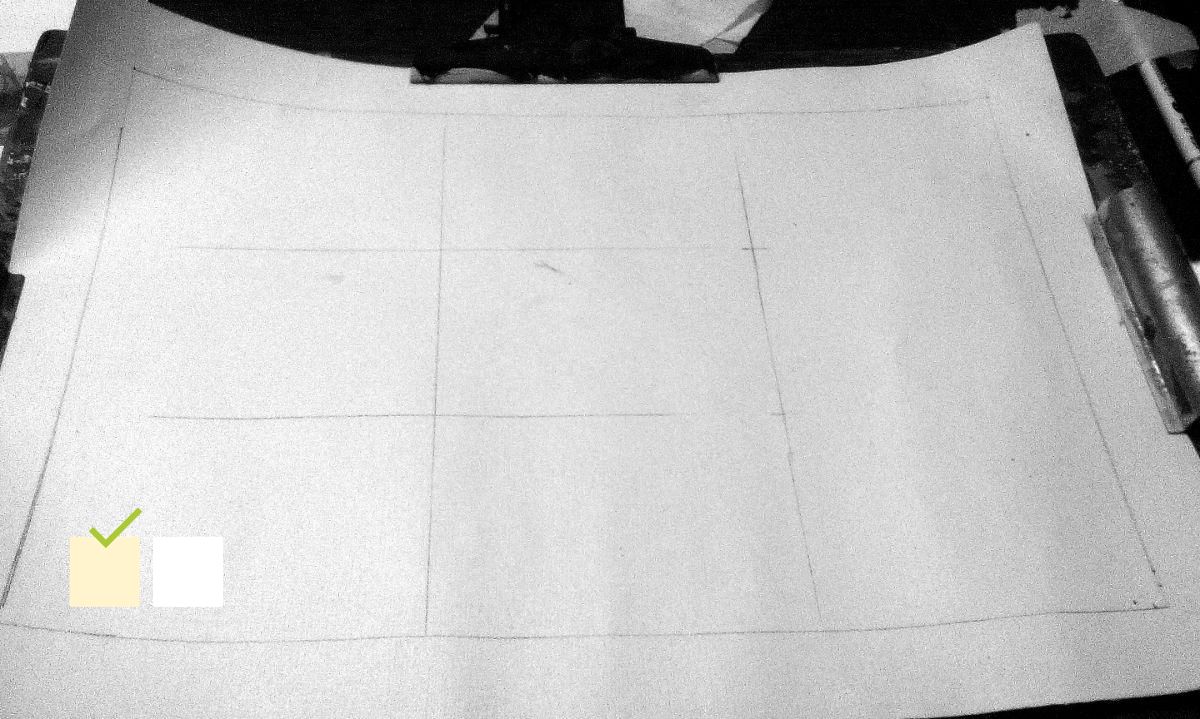
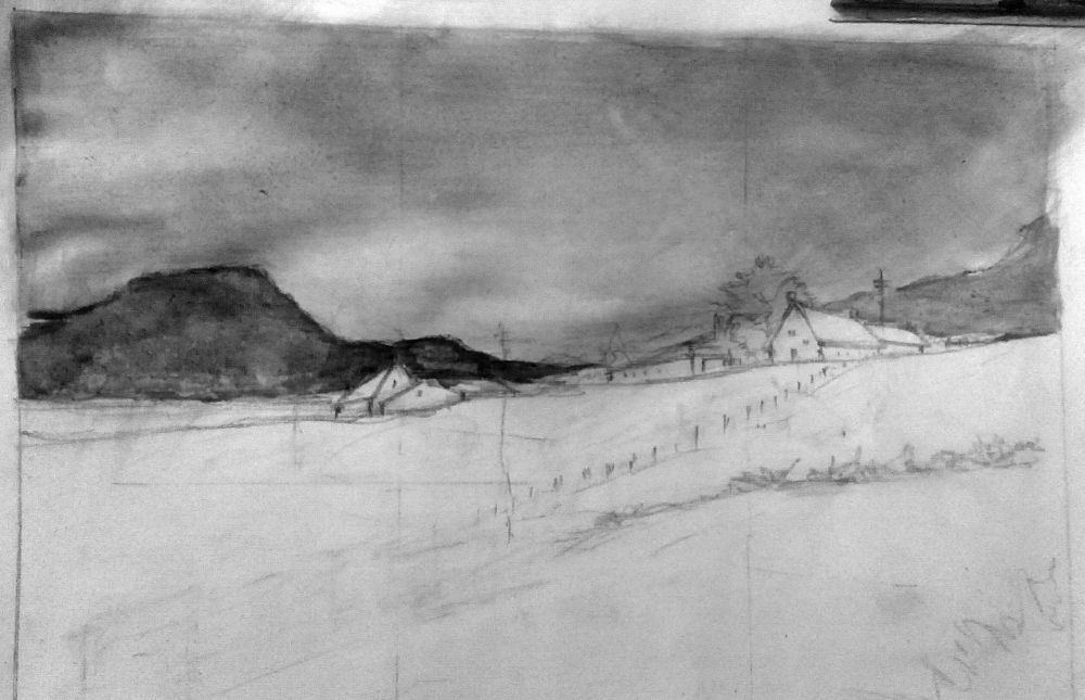
- The page is not white for a good reason.
- A simple border and rules of third guides have been placed.
- The horizon should be near the horizontal line of the guides and the object of focus should be at the intersection of the horizontal and vertical lines.
- The paper was pre-primed for oil paintings. Drawing on such paper can always become a little mess. But fear not. It doesn't matter how you start, it matters what you do after that.
- Using a HB, 2B or such hard pencils will decrease the chance of mess on paper.
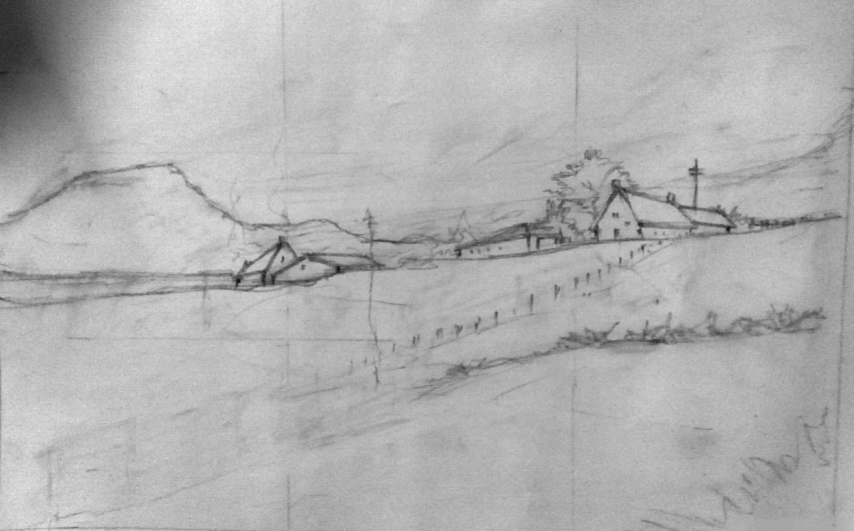
- Notice the horizontal line starts near the lower horizontal line and goes upward to the upper horizontal line of the guides. And the houses which are the objects of focus, are sitting at the intersection of the horizontal and vertical lines of the guides.
There are other focus guiding methods too like the golden rectangle, golden spiral, harmonious triangle etc. Use any of those as per your choice. - Notice the extreme right hand corner bush. That's my escape plan.
The page is not white. So I am free to introduce as much brightness as I want. It is like starting with a middle ground and going towards the both end ie. darkest dark and purest white. Only pro artists can start at any one end and comfortably go towards another end (white → black or, black → white) because they know well how to calculate down or up from the previous value to the next to achieve a distinguished value scale.
Yet, starting with a middle ground always gives you freedom to move comfortably.
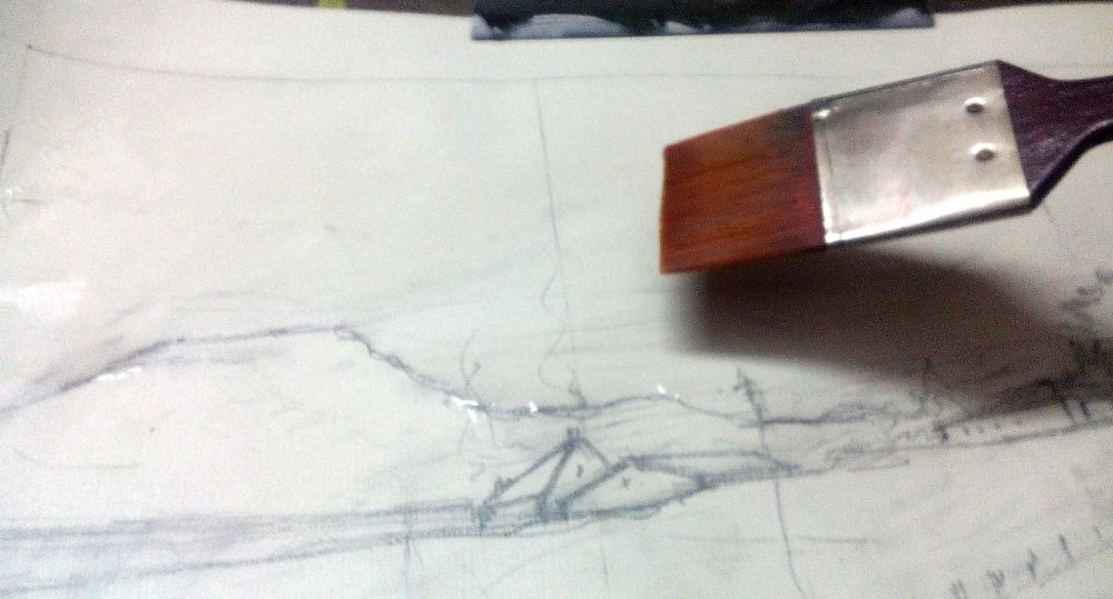
- A simple water wash was done for the sky...
- ...Followed by an ink wash to mark the sky and the hills.
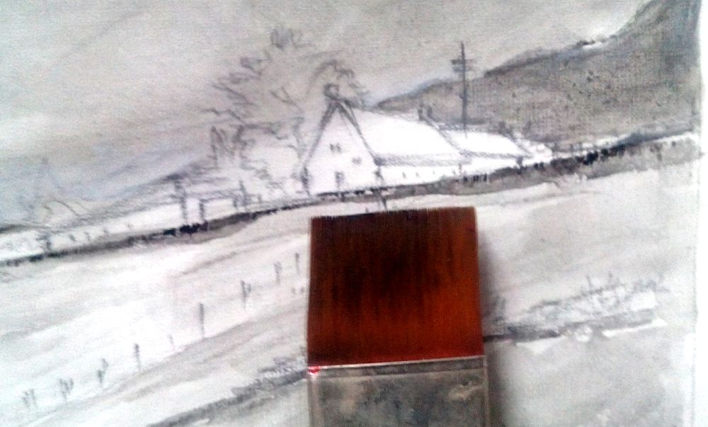
- With the tip of a flat wash brush, marked the edge of the land in distant ground near the houses. It should be darker where the houses are than the other parts of the ground.
- Also the foreground got washes of black, marking the slope.
- The slopes are marked with darker black.
- The grey values are put on the walls of the houses.
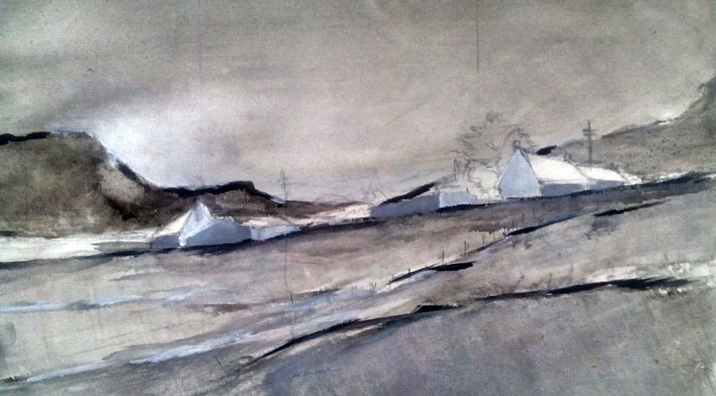
- The sky got a layer of black and white paint. Just to cover the page underneath and to form a dark sky.
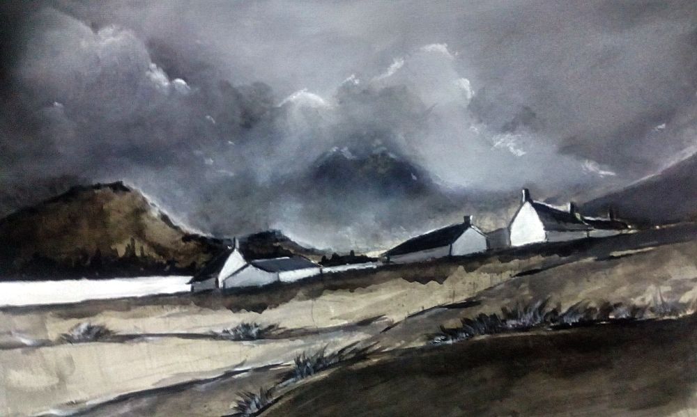
- Slopes of the ground are marked with darker black.
- Grey values of the houses are strengthened.
In most paintings, we start by establishing darkest dark and go towards the white. You may ask why not white to black? Because, simply it's troublesome.
By simple physics knowledge, we all know that white is the combination of all lights (and we can see colours according to which object absorbs which light), where black is the perfect absence of all lights, and so of hues as well.
Now, simple question - If there is nothing - adding something there is easier or eliminating something from where every thing is present?
Of course, adding to where is nothing.
Yet, we keep a safe ground in monochrome paintings. And drawings as well. We start by black, true, but not the darkest dark. Since this black and white are all we got, we keep our options open to go back towards purest black, when needed. We start with a middle black that gives us an understanding that how black we can go back.
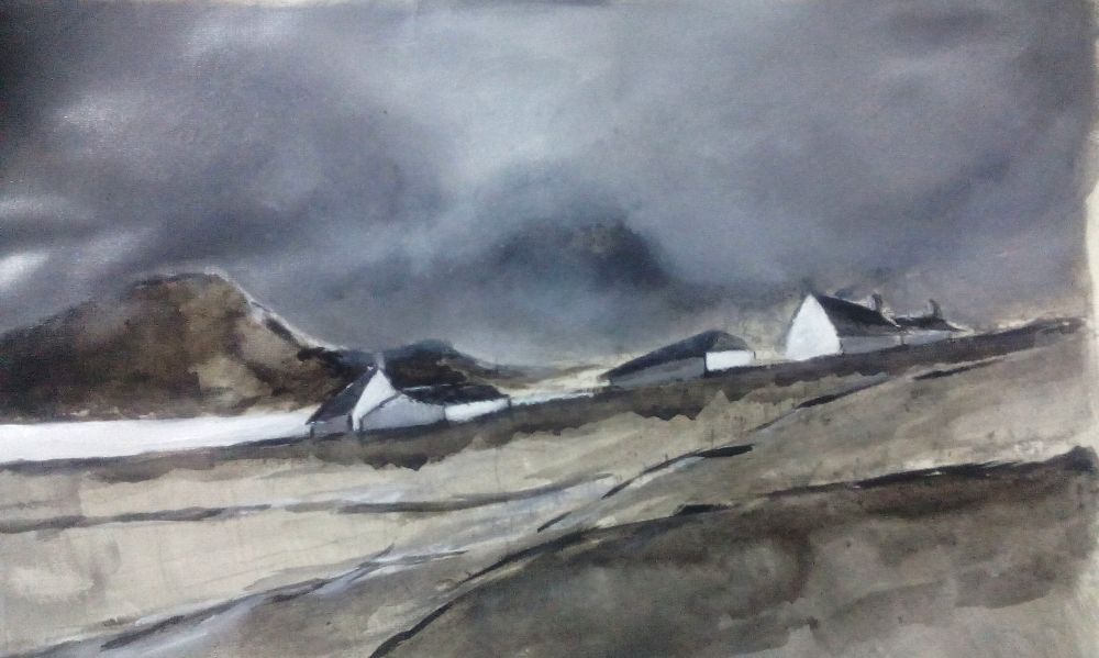
- Base formation of clouds.

- If you notice... the clouds are the easiest part of the painting. Just move your brush or finger round and round mixing paints.
White has all the colours - what you can possibly add to it? Every hue you add will look fade or darker than white. All we can do is to eliminate hues from that, resulting lesser tones, until there is nothing left - hence, black.
Now if the whole scene of elimination turns desaturated - what leaves there? Greys. They are nothing but the values of the colours we were eliminating. So, the grey that you establish on your black and white drawing or painting is nothing but the adjacent colours that are representing those parts - only in their purest form. Value is simply the measure of light and dark of a particular hue. Now two hues can have same values. Digital science says no two colours can have same grey value and that is true. But this can not be distinguished in human eyes. So, to say correctly, two colours may have a very close grey value which is indistinguishable. And we must avoid that. Because if you can not distinguish something, how you will even establish that to convince your viewers? So we must not let two hues' values come close, neither in monochrome nor polychrome paintings.
Moving on -
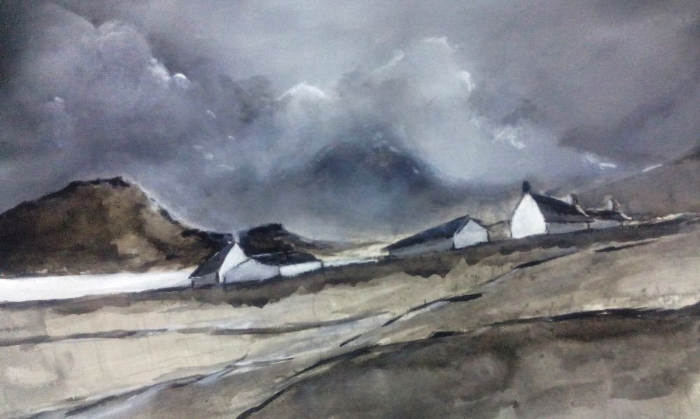
- Details of the clouds were added.
- Grasses were introduced on the foreground and highlighted with bright grey white.
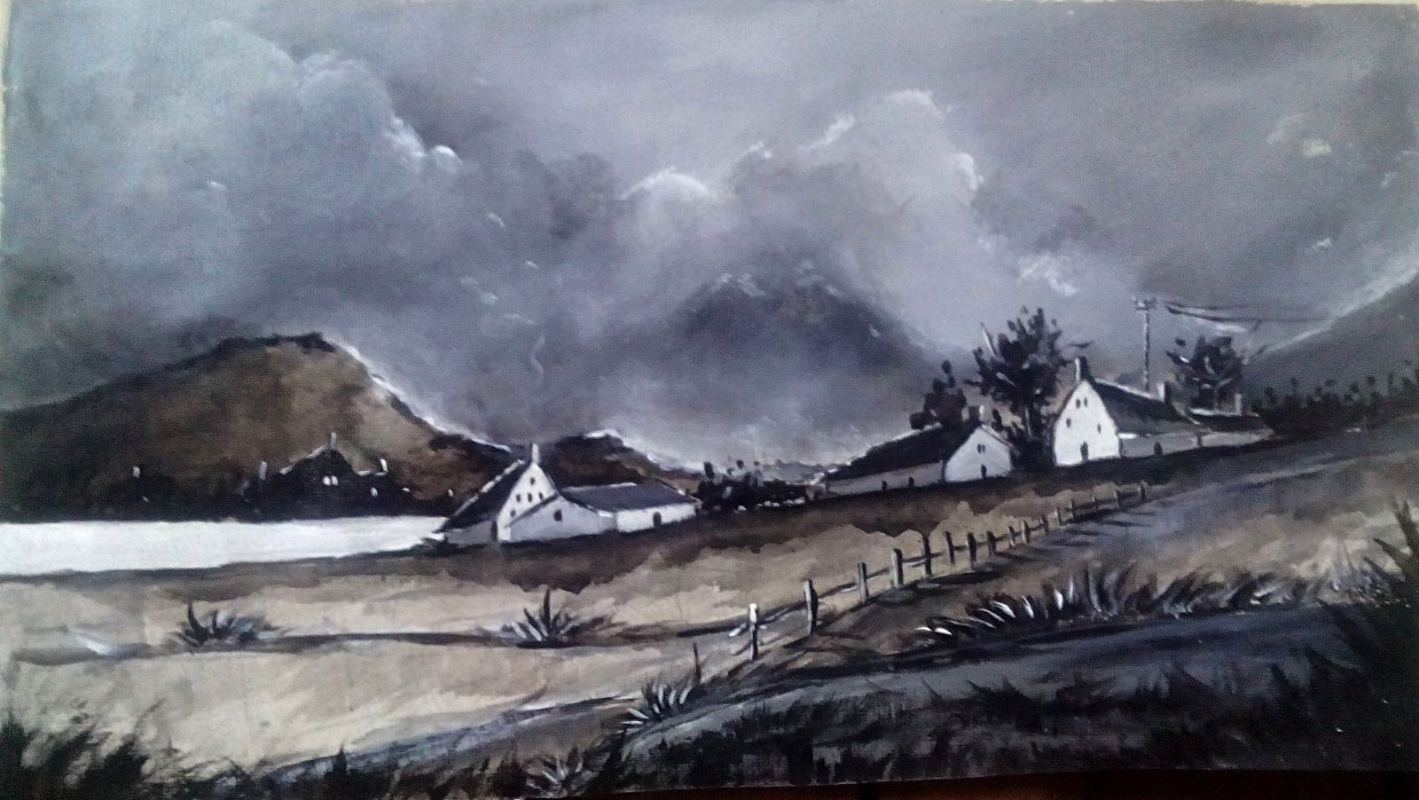
- This is not the best example though - the extreme right hand side house is having the brightest wall among a darker background. This is called isolation contrast.
- With a round brush, South West ↙ motion was introduced to paint the wash of black ink to distinguish the shadows of the grasses on the ground.
In paintings where colours are present, it is very difficult to determine, values for each hues, so that they don't intermix. You have two scales there - simple value scale and a complicated hue scale (saturation, intensity, temperature). You have to manage that hue scale while continuously considering the value scale.
That is why, we often start with black or dark in paitnings - adding one at a time instead of eliminating. Elimination in a colour painting will be a tough job and can only be done by the pro artists. In monochrome, we are free to start from anywhere almost - add or eliminate - doesn't matter, because we are going to follow a simpler scale.
A simple scale and a simple way to represent the colours and temperature. And for being done by only pure light and black - it comes forth dramatic, raw in mood.
Establishing the representative greys are not the most skillful part of such paintings. The skillful part of the monochrome paintings is seeing the values through the hues - to break it down to its simplest form. Under painting does this tough job for an instance.
Simplifying a complex situation to purify the mood - that is why the monochrome paintings are avant-grade paintings.

Before I discuss why I needed the Escape Plan, we need to know when we need it.
We need the escape plan when (1) you do something on the canvas that you did not intend to do (2) If there is an accident (3) if you were uncertain about some parts or, (4) if you overdid something.
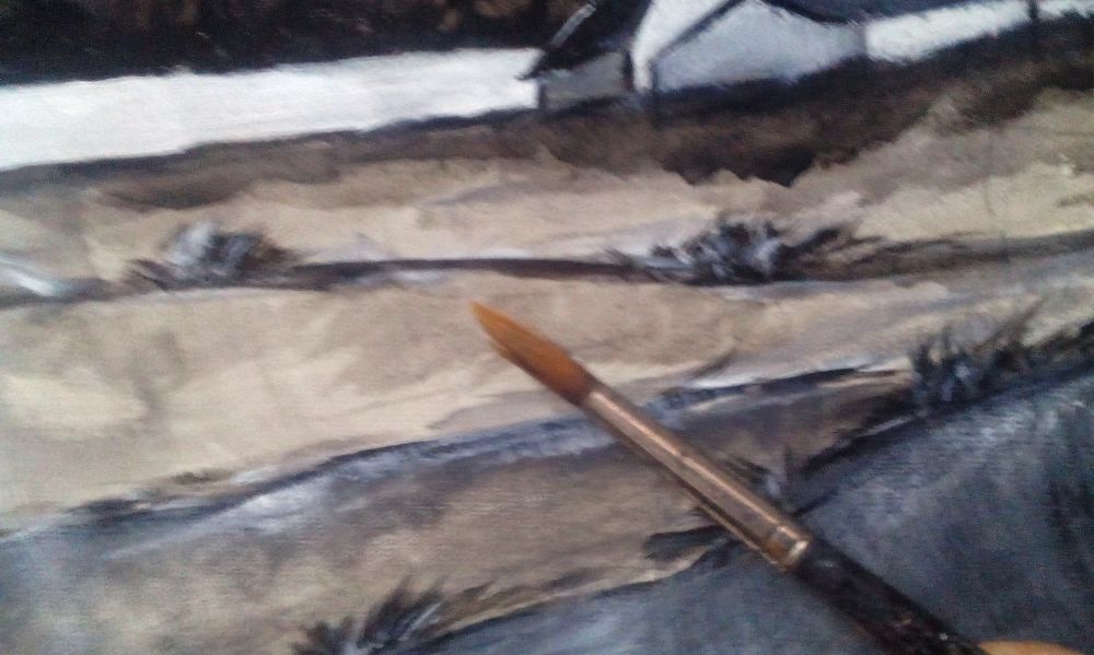
Every artist can have a bad day and they all mess up at some point more or less and yet very few will agree to this fact. When I was doing this painting, I was drawing and painting from imagination - I had no visual reference. Thus the foreground turned mismatched with the rest of the scene. The ground can be done precisely with lots of grey values representing the lush green, various temperatures and all. But those would be heavily time consuming. I was unsure about that part from the beginning, so I kept my escape plan ready - keeping it simple and more than it should be. Notice, there is absolutely nothing going on the foreground. So I can either (1) subtract it or (2) cover it. That is all we can do in our escape plan.
I did both.
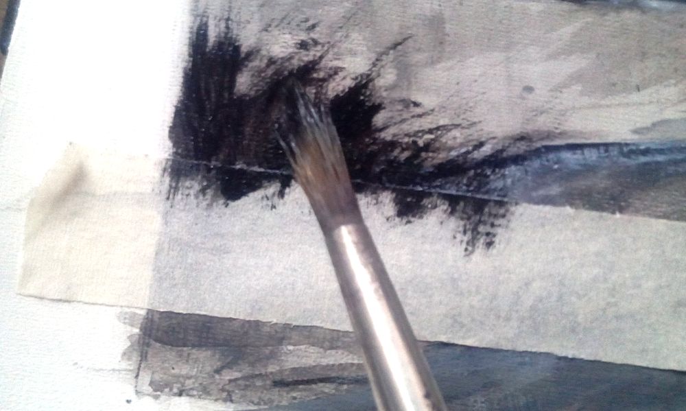
- Covered the unwanted part of the foreground with masking tape.
- Used the round brush down to up motion to introduce the darkest foreground hedges.
- It also helped me to establish the foreground as purest black, as it should be.
Bad day at the Harbour
For your inspirations only


FIN

A Walkthrough in Monochrome Paintings
Basics Of Still Life Painting
A Discussion On Backgrounds In Paintings
A Brief Discussion About Tonal Contrast
What Ruins A Painting?
Beware of Green!
A Brief Discussion On Limited Palette
Painting With A Knife! (The Theory)
If you have found the articles helpful, head over to my Facebook page and show your appreciation.

Thank you.